Saturday, July 31, 2010

More Koni

With the success of Koni Waves comes the demand for more commissions.
The Arcana-produced property has developed a respectable following over the past few years, and the opportunity to promote it further was a fun prospect for me.   Koni's creator and lead artist, Steve Sistilli, published an 'Art of Koni' book that flew well with fans enough to put out a 2nd volume, and it seems a 3rd one is on the way.  And being a close pal of Steve's, I'm more than happy to oblige when I can.
It's not only another opportunity to see my work in print, but it is a kick when I have the chance to hang out with him at a comic convention.  We get to act like a couple of kids, and glad-hand with all the attendees.

Here's a couple of more recent posters ready for print;

Print size on the following is 18" x 33"


The below large poster prints out at 36" x 48"


Not too difficult to see why the comic fanboys love Koni.

She's always ready to kick some monster ass.

Thursday, July 29, 2010

portrait study of Lon Chaney Sr.

I've been a fan of Lon Chaney Sr. since I was a little kid. To me, his portrayal as Erik in The Phantom of the Opera is still bone-chilling.
But his work as one of films' premier character actors goes far beyond his more memorable roles as The Phantom or The Hunchback. That fact has been lost largely to the passing of almost 90 years, ..but it's also a fact that not many photos of Chaney, as himself, even exist, since he was a pretty private person off camera.

..Still, I wanted to generate a color portrait of the man 'out of character' that I thought captured his essence. I googled the best I could and this was about the best photo I could find;


Old photos like this can be a pain to work from. Either contrasty or washed out, and this one is no exception. In spite of the glorious and well-lit glamor photos by old-school Hollywood photographers like Josef Von Sternberg, George Hurrell, or Laszlo Willinger, there aren't really any richly lit photos of Chaney like that to be found.

But a little imagination and artistic license can add additional light sources, as well as reduce shadows and glare to a (hopefully) more accurate and rich image of what once was.


..That friendly but mischievous expression does seem to capture his essence.
I hope I've given the man's countenance a little due justice.

Sunday, July 25, 2010

Scooby-Doo Mystery Machine - iPod touch dock/player clock

This novelty electronic was designed specifically for Apple's iPod touch.
What car doesn't have a stereo? And the notion of an RC vehicle that doubles as an iPod dock/player seems like a novelty to me. Any number of cool vehicles present themselves as a candidate for such a concept, but the application of a perennial license like Scooby-Doo was one way to get this concept across in a way that would appeal to teens and baby boomers. Especially if there's some neat animated feature to play with.  As much for a Nick@Nite watcher as the Sharper Image shopper.

My illustrations show the dual function;


Here's the Mystery Machine in its static state, the iPod touch shows scale and rough position where it drops into the slot dock on the van's rooftop.


Open up the back end and its display becomes the TV screen on the inside of the van.
The wall speakers function for stereo sound, the mirror ball spins, and the sculpted Scooby bobs his head in time with the music (much like your average iPet).
The tail lights function as manual controls for the iPod, and the license plate is an LCD display for track number, volume level, or even AM FM signal.


Spin Scooby around, and he can join you while you view any videos you may have stored.
The same LCD screen displays running time, or can function in clock mode.

Friday, October 30, 2009

Crimson Skies: 26 planes


Before it became a popular XBox game, Crimson Skies was originally a PC game conceived and produced by FASA Interactive.
FASA was a Chicago-based game company headed by a fine fellow named Jordan Weisman, that created and produced role-playing and PC software games. I was brought in as a conceptual artist on this, as well as some later projects that would ultimately be produced for XBox and Playstation.

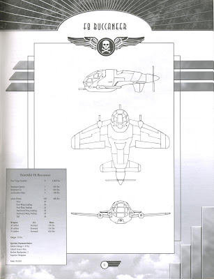
Crimson Skies was one of the first projects on which I worked. The developers there were putting together an 'Aircraft Manual' for the PC game, which would contain the basic rules of game play, but also technical descriptions and illustrations of all the different models of planes used in the game. Given the game's premise, scenario, and time period, these planes defied conventional design for a more 'steroid injected' look. These were aggressive dog-fighters.
I was given the copy pages describing each plane, then I was given free reign in designing them.
They would need orthographic views of each plane drawn for one page, and a 3/4 view action shot of the same plane for the other.

The view drawings were done using fine felt-tip pen, and the dramatic action shots were rendered using gray-toned Pantone markers.
With some minor back-and-forth feedback, all 26 planes took about 4 weeks to design and render for delivery.

Here are 12 of the 26 planes found in the published manual;


The people at FASA were a joy to work with. Focused, creative. and fun. Over a period of 2 years I had the opportunity to generate characters, wardrobe and accessories, vehicles, storyboard cinematic sequences, visualize landscapes, cityscapes, exotic structures and their interiors. Much of this conceptual work either helped define the overall look of a game, or was used directly in constructing them digitally in the actual program.
By the time I finished working on my third project with them, Jordan had offered me a permanent position there as staff artist. It was tempting, and while I was considering it they got a lucrative offer from Microsoft. My offer still held, but Bill Gates ended up moving FASA's offices, and most of its staff, to Seattle upon acquisition.

Tuesday, August 26, 2008

Virtual oils

I found this while cleaning through my hard drive. It’s a study from years ago when I started working with my Wacom tablet and Corel Painter. I’ve never really explored Painter thoroughly, ..not even really using it for the Koni pieces I did for my friend Steve. It’s a fun tool though and I should consider cultivating some real skills with it. I guess when it comes down to digital painting I'm a die-hard Photoshop man.

I've always loved this photo, though.
It’s actor Conrad Veidt. A frame from ’The Hands Of Orlac’, made in 1928. I'm a silent film nerd and I like the idea of using old photos as reference for color illustrations rather than colorizing or tinting.
It has made for some pretty striking movie posters over the decades


Wednesday, August 20, 2008

The Diner Phone

Some years ago I worked on a series of novelty electronic items for Segan Animations and Telemania. They've been forerunners in novelty electronics for years and they still continue to come up with crazy concepts for telephones. The pleasure of designing stuff like this is in the attention to detail they put into them, and this was no exception.

I had initially done some design work on their Barbie telephone and clock radio, and they liked what I had done enough to bring me in on designing a phone that looked like an old mid-century dining car.
They provided me with the basic idea and how it would function. The roof of the diner would remove to become the hand set, while it revealed the interior of the diner.

Oh, and when the phone rings it plays Bill Haley's 'Rock Around The Clock'.

I spent some time researching different classic dining car diners, combining the classic elements like glass block, stainless steel, and using a palate of red, black and white.
I presented them with this marker rendering for inspiration, and they told me to run with it.

Once we had a defined look it was a matter of fleshing out the interior, which wasn't difficult from a design standpoint. I had already seen enough and had even eaten in a few of these kinds of dining cars because there were still a few around where I lived at the time.

I generated a 3/4 view of the inside, then added in some characters, since they felt it should have more personality.
Once again, I drew from archetypes of that era; a teenage boy and bobbysoxer holding hands and
sharing a malt, a traveling 'Fuller Brush' salesman, a jolly short-order cook, a counter waitress, and a policeman interacting with a mischievous kid.


I took details of the inside figures and generated larger turn-around drawings to give the sculptor something specific to work with.

A couple of years after I worked on this I ended up meeting the artist who did all the sculpting for this project. We both shared a laugh over the details that went into it, and he thanked me for providing him more than he needed to do the work.
The figures in this diner would only be about 3/4 of an inch tall.


Toward the end they decided the free-standing neon sign for "Joe's Diner" was a little much, so they asked me to generate a series of alternatives, one of which would be used on the diner itself so no base would be needed.
Here are some of the variations I came up with;


In the end this is what the final product looked like;


Here is the rendering for the Barbie clock radio I had done;


Of course there are always projects that never make it to the store shelf. The following is a rendering for a proposed "Wizard of Oz" Emerald City phone that, while fun, was simply too elaborate to be cost effective.

But I did have a lot of fun designing it.