Thursday, August 19, 2010

Zooballs!

Back in the 90s Tyco Toys called on me to do some conceptual work for their plush line.

The pitch was simple; They're plush animals that are round bouncy balls. (Ah, minimalism!)  
The real task was in making them cute, fun, and marketable, like Beanie Babies (which were HUGE at the time). ..In fact, the price point and consumer niche was geared to compete with the Ty Toys phenomenon. 

Really, there was nothing that was not fun about this project.  I was given free reign regarding what animals to caricaturize, and no limit in the number generated.  It was 'blue-sky' concept work, so I had a good time seeing what I could come up with.
There was some back-and-forth of sketches and ultimately the creatives at Tyco whittled it down to 18 different character balls.  Most of them ended up being designs of mine, with about 5 of them being done internally (which they had me redesign for the sake of consistency).

..And they now had a name:   

Zooballs!

Another great thing about this project was that what I initially came up with was pretty much what ended up on the toy shelves.  A rare occurrence, as typically other designers and/or marketing people will add their own tweaks along the way. I guess everyone thought what I came up with was dandy enough.  ..Though, as mentioned, there were a handful that never made the cut.
..like these poor orphans;


The ones that did make it through the gauntlet needed final renderings for presentation and manufacturing purposes.  There were no Zooball prototypes in existence and these were going to be fabricated overseas, so they needed some solid reference material.  Tyco asked me to generate 2 views of each Zooball character to send to Hong Kong.  'Mugshots' ..if you will.
Here are examples of just some of them;


..for the record? No; I didn't actually pick the names for these guys.

That was someone else's lucky job.

Monday, August 9, 2010

Jumping Sharks and Dinosaurs

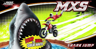
A while back I was brought in to develop a couple of fun stunt bike concepts for Jakks Pacific's MXS Road Champs line.
These toys use the classic 'zip strip' mechanism to power their stunt bikes, and Jakks was working on upping the ante for their thrills and spills.

The first one seemed like a given;
Jumping the Shark.


Sure, it's a cultural joke, implying the 'selling out' of integrity, ..but SOMEBODY had to make a toy out of it, right?
No Fonzie here, though.  Sorry.
This concept employed a battery operated shark head who's jaws clamped shut at intervals, challenging the rider to time the jump just right.

I initially explored 2 different themes;  A 'Carnival' theme and a 'Mad Laboratory' theme.
Early on, as is often the case, there is some real fun in conceptualizing how these things will look, and what comes in the box.  In this case they wanted to include a catch net at the end, and a loop stunt that the rider would need to navigate before going up the ramp. ..Really the ideal thing to disorient any rider on his way to daring jaws of death.
Ultimately, when these concepts go through costing, some of the extra stuff gets trimmed in order to keep the final price down.
But here are the initial drawings that sold the idea;


The 'Carny' theme


The 'Mad Lab' theme


Not to be outdone by themselves, however, Jakks wanted to heighten the danger.
And what could possibly be more threatening to a stunt cyclist?

Jumping a Tyrannosaurus Rex, of course.

..But not just any T-Rex.
This particular Rex was a roaring live skeleton, and could swallow you whole!
The idea used the same battery operated biting jaws as the shark, but instead of jumping across the gaping maw, the rider had to jump over the head, and successfully ride down the backbone and tail to complete the stunt. And if you got caught by the jaws of the T-Rex?  You ended up imprisoned in its ribcage!

And did I mention this T-Rex glows in the dark?

Well, it does.

That's right. Eat your heart out, Evel Knievel!


I must admit, I was concerned about the mechanical logistics around this one, but dammit it worked!
I had a lot of fun designing this, and it came out pretty much as I had drawn it.  The only thing that went due to costing was the base that I designed for it.
Here's the initial concept drawing that was presented;


Once it was approved, I had to generate a few sketches showing how the skeleton's parts looked and functioned.  Because of how this thing worked some creative license had to be taken to allow the bike to be 'swallowed and caged', as well as roll down the spine;


Thursday, August 5, 2010

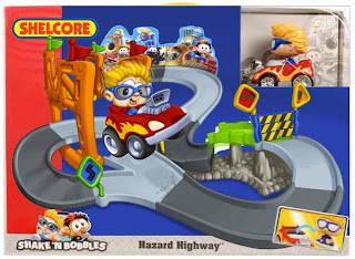
Shake'n Bobbles Hazard Highway

After I had generated some illustrations for their Monster Sports Games, Shelcore asked me to revise the packaging art for their Shake'n Bobbles Hazard Highway, which was commercially promoted;

AWESOME!

The marketing folks at Shelcore felt the existing art was somewhat inaccurate, as well as busy and confusing in how the set was presented. They also felt the angle of the illustration didn't highlight the features in the best way.  So, I was given some new direction and asked to take a crack at it.
Here's the existing;


The main points to tackle;  1. A fun but clear vision of what this thing looked like when in action,  2. A better representation of the item itself, and 3. Instead of featuring the rocking green bridge they wanted to show the car dropping from the upper deck of the orange break-away bridge to the track below.
They did ask me to purposely omit the clumsy dropping platform connected to the bridge for simplicity (which is why it's not seen in the final revised art). Otherwise; "make it look like it works".

To make things easier for myself and Shelcore in assembling the final image, I generated some of the key elements separately. Mainly the character/car, and the track set itself.
Here are the pencil sketches I submitted for approval;


I included a paste-up version with the car in place and given approval on the basics, after a couple of tweaks, I started work on the final art for print.  Unfortunately,  Shelcore went through some management changes while in progress, and the project was killed.
..Still, not one to let the work done go to waste, I took some time to finish up the project on my own down-time.
Here are the finished illustrated elements as separated;


Finally, I assembled the parts in one piece of art, adding motion to the rocking bridge feature, and bobble-head.  Here's the final art ready for print;


..and here's a mock-up of what the revised package may have looked like;


Sunday, August 1, 2010

Grouchland vehicles

Back in the late 90s I got a call from the folks at Fisher-Price Friends for this fun project.
At the time, the talented and creative people at Jim Henson's studio were working on production design for their feature film;
The Adventures of Elmo In Grouchland. 

F.P. Friends (or Tyco Preschool, as they were called back then) held the Sesame Street / Muppet license for producing toys, and I was one of their go-to freelancers for many of their related concepts.  Often when a studio and toy company share a close working relationship, the studio will call on product development to come up with concepts in a tandem effort to shorten turnaround time at both ends.

The parameters for this assignment were pretty straightforward;  Come up with a handful of vehicles comprised entirely of junk.
The resulting concept sketches were a series of drivable ready-mades that could pass as cars, trucks, and vans for incidental use in populating the world of Junk.


The last 2 vehicles had already been designed for use in the movie, but Fisher-Price and Henson wanted concept drawings for each.

These were already being considered for toys in the line, and they wanted something for context in relation to the vehicles I came up with.


..RIP, Mr. Henson.
Thanks for all the joy.

Saturday, July 31, 2010

More Koni

With the success of Koni Waves comes the demand for more commissions.
The Arcana-produced property has developed a respectable following over the past few years, and the opportunity to promote it further was a fun prospect for me.   Koni's creator and lead artist, Steve Sistilli, published an 'Art of Koni' book that flew well with fans enough to put out a 2nd volume, and it seems a 3rd one is on the way.  And being a close pal of Steve's, I'm more than happy to oblige when I can.
It's not only another opportunity to see my work in print, but it is a kick when I have the chance to hang out with him at a comic convention.  We get to act like a couple of kids, and glad-hand with all the attendees.

Here's a couple of more recent posters ready for print;

Print size on the following is 18" x 33"


The below large poster prints out at 36" x 48"


Not too difficult to see why the comic fanboys love Koni.

She's always ready to kick some monster ass.

Thursday, July 29, 2010

portrait study of Lon Chaney Sr.

I've been a fan of Lon Chaney Sr. since I was a little kid. To me, his portrayal as Erik in The Phantom of the Opera is still bone-chilling.
But his work as one of films' premier character actors goes far beyond his more memorable roles as The Phantom or The Hunchback. That fact has been lost largely to the passing of almost 90 years, ..but it's also a fact that not many photos of Chaney, as himself, even exist, since he was a pretty private person off camera.

..Still, I wanted to generate a color portrait of the man 'out of character' that I thought captured his essence. I googled the best I could and this was about the best photo I could find;


Old photos like this can be a pain to work from. Either contrasty or washed out, and this one is no exception. In spite of the glorious and well-lit glamor photos by old-school Hollywood photographers like Josef Von Sternberg, George Hurrell, or Laszlo Willinger, there aren't really any richly lit photos of Chaney like that to be found.

But a little imagination and artistic license can add additional light sources, as well as reduce shadows and glare to a (hopefully) more accurate and rich image of what once was.


..That friendly but mischievous expression does seem to capture his essence.
I hope I've given the man's countenance a little due justice.

Sunday, July 25, 2010

Scooby-Doo Mystery Machine - iPod touch dock/player clock

This novelty electronic was designed specifically for Apple's iPod touch.
What car doesn't have a stereo? And the notion of an RC vehicle that doubles as an iPod dock/player seems like a novelty to me. Any number of cool vehicles present themselves as a candidate for such a concept, but the application of a perennial license like Scooby-Doo was one way to get this concept across in a way that would appeal to teens and baby boomers. Especially if there's some neat animated feature to play with.  As much for a Nick@Nite watcher as the Sharper Image shopper.

My illustrations show the dual function;


Here's the Mystery Machine in its static state, the iPod touch shows scale and rough position where it drops into the slot dock on the van's rooftop.


Open up the back end and its display becomes the TV screen on the inside of the van.
The wall speakers function for stereo sound, the mirror ball spins, and the sculpted Scooby bobs his head in time with the music (much like your average iPet).
The tail lights function as manual controls for the iPod, and the license plate is an LCD display for track number, volume level, or even AM FM signal.


Spin Scooby around, and he can join you while you view any videos you may have stored.
The same LCD screen displays running time, or can function in clock mode.