Tuesday, August 26, 2008

Virtual oils

I found this while cleaning through my hard drive. It’s a study from years ago when I started working with my Wacom tablet and Corel Painter. I’ve never really explored Painter thoroughly, ..not even really using it for the Koni pieces I did for my friend Steve. It’s a fun tool though and I should consider cultivating some real skills with it. I guess when it comes down to digital painting I'm a die-hard Photoshop man.

I've always loved this photo, though.
It’s actor Conrad Veidt. A frame from ’The Hands Of Orlac’, made in 1928. I'm a silent film nerd and I like the idea of using old photos as reference for color illustrations rather than colorizing or tinting.
It has made for some pretty striking movie posters over the decades


Wednesday, August 20, 2008

The Diner Phone

Some years ago I worked on a series of novelty electronic items for Segan Animations and Telemania. They've been forerunners in novelty electronics for years and they still continue to come up with crazy concepts for telephones. The pleasure of designing stuff like this is in the attention to detail they put into them, and this was no exception.

I had initially done some design work on their Barbie telephone and clock radio, and they liked what I had done enough to bring me in on designing a phone that looked like an old mid-century dining car.
They provided me with the basic idea and how it would function. The roof of the diner would remove to become the hand set, while it revealed the interior of the diner.

Oh, and when the phone rings it plays Bill Haley's 'Rock Around The Clock'.

I spent some time researching different classic dining car diners, combining the classic elements like glass block, stainless steel, and using a palate of red, black and white.
I presented them with this marker rendering for inspiration, and they told me to run with it.

Once we had a defined look it was a matter of fleshing out the interior, which wasn't difficult from a design standpoint. I had already seen enough and had even eaten in a few of these kinds of dining cars because there were still a few around where I lived at the time.

I generated a 3/4 view of the inside, then added in some characters, since they felt it should have more personality.
Once again, I drew from archetypes of that era; a teenage boy and bobbysoxer holding hands and
sharing a malt, a traveling 'Fuller Brush' salesman, a jolly short-order cook, a counter waitress, and a policeman interacting with a mischievous kid.


I took details of the inside figures and generated larger turn-around drawings to give the sculptor something specific to work with.

A couple of years after I worked on this I ended up meeting the artist who did all the sculpting for this project. We both shared a laugh over the details that went into it, and he thanked me for providing him more than he needed to do the work.
The figures in this diner would only be about 3/4 of an inch tall.


Toward the end they decided the free-standing neon sign for "Joe's Diner" was a little much, so they asked me to generate a series of alternatives, one of which would be used on the diner itself so no base would be needed.
Here are some of the variations I came up with;


In the end this is what the final product looked like;


Here is the rendering for the Barbie clock radio I had done;


Of course there are always projects that never make it to the store shelf. The following is a rendering for a proposed "Wizard of Oz" Emerald City phone that, while fun, was simply too elaborate to be cost effective.

But I did have a lot of fun designing it.


Thursday, July 24, 2008

Promotional posters

My good friend and colleague Steve over at Rough Sketch Studios has been hard at work creating and publishing his own comic books for a few years now. They're doing pretty well, and as much as he has encouraged me to create and illustrate my own book series, I simply haven't yet had the time to make the commitment.
But it hasn't stopped me from contributing some one-off illustrated posters to promote his titles.
The print sizes on these are about 28" wide.

The first piece was done in '06 to promote his Koni Waves series.
Koni is a private detective living and working in Hawaii, and the premise is roughly a cross between Modesty Blaise and The X Files.
The intent for this pin-up was to show the character of Koni surrounded by elements and minutia of her daily life, ..which gets pretty surreal and creepy.
It was a challenging piece, but a lot of fun went into the details.
There are some little easter eggs in there.


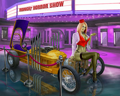
Another title that Steve's studio is producing is a book called Velvet Rope.
It's a horror anthology much in the vein of "Creepy" or "Tales From the Crypt".  Except instead of a gnarly old uncle or a cackling zombie corpse, the segments are hosted by "Velvet", an undead vixen and grindhouse movie usher.

Steve's idea.

Anyway, I'm a big fan of Psychotronic culture and old horror, so I gravitated toward this pretty easily. Steve suggested the idea of Velvet standing next to an old hearse, or a "Big Daddy Roth" kind of Hot Rod. I zeroed in on grandpa Munster's "Dragula", created by George Barris back in the mid 60s.
I thought it made the perfect car for Velvet.

Friday, June 27, 2008

A boy & his dog

Like a lot of kids who grew up to become illustrators I liked to draw cartoon characters and superheroes. Over the years I've worked with scores of licensed characters and properties in the toy business, and my love of character and production design started getting me projects where I'd be asked to come up with original character designs for toys at Mattel, Hasbro, and Fisher Price.

Some of that work will be covered in future posts.
These sketches are the result of an exercise I came up with for myself. One reason was for the experience, but also should any director or design manager ask to see some original character work.

The idea was to explore a range of looks for simply "a boy and his dog". The only restriction I gave myself was that the characters must be capable of being sculpted (no 'floating' elements like eyebrows). Nor could it be too graphic-based (Computer Generated, expressively 'inky' or 'washy', etc.)

I tried to cover a broad range of looks, bearing in mind the requirement of some visual chemistry between the 2 characters. Part of the challenge (and great fun) was playing with different ways the 2 could widely differ, but still complement each other.

Here's what I came up with;


I've always thought these sorts of personal side projects are vital for an artist or illustrator who is out there trying to make a living. They're essentially self-directed projects that work certain muscles and, over time, bring a lot of range and diversity to what you can show an art director.

I've been lucky enough to get work doing other production design for film and video games, having contributed vehicle designs to the 1999 film
The Adventures of Elmo in Grouchland.

Tuesday, June 24, 2008

The Editorial years

When I graduated from college in 1985 I hit the private sector as an aspiring illustrator. It seemed that the coolest thing to get into was editorial and publishing work, since the other alternatives suggested to the students were Advertising, children's books, or medical and technical illustrators (for visual reference).

I put a portfolio of work together and hawked around the magazine and periodical business for about 7 years.
During that time I worked regularly for a variety of publications like Crain's Business, Outside, Playboy, National Lampoon, Student Lawyer, The Atlantic Monthly.
I really enjoyed doing this kind of work, ..but the assignments were inconsistent, and it never paid well enough to cover all the rent. During this time I supported myself by working at an advertising agency, ..which, after 5 years, was more than enough. I had my own personal work to nourish me, and once I got into the toy business I was so busy that I stopped pursuing editorial work altogether.

All of my editorial work was done before the advent of Mac and Phototshop.
I worked with gouache wet media and colored pencil, developing a 'resist' technique that gave a textural and atmospheric feel that I liked.

These are unretouched.


..this Escher-esque piece inspired one art director to suggest the following, for an article on the acceptance of women CEOs in the corporate world;


..some other spot illustrations;


Over the years, a number of art directors have suggested that I pursue illustrating for children's books.


I had a nice working relationship with Playboy Magazine, and they even called me to do a few 2 page illustrations on occasion. This is one of several spots I did for them sometime in the early 1990s;


This is an illustration for the cover of a 1994 issue of Student Lawyer magazine;


Friday, June 13, 2008

Monster Sports cards

In 2005 I was approached by Shelcore to create illustrations for a line of handheld sports games. The games themselves were themed to 5 different sports, and the characters representing them would be these crazy looking monsters. The handheld games and characters already existed. My part would be generating collector sports cards for each character. ..like a Topps baseball card replete with name, stats, and other invented details. The parameters? An 'action shot' of each monster 'making their moves'. The print size of these illustration would only be the standard 2 1/2" x 3 1/2" , but I did them at 8" x 10" for detail. I went for exaggerated perspectives.
The 'Big Daddy Roth' feel of these characters lent itself to that approach, so it worked out pretty well.

The approved pencil drawings were rendered in Photoshop.