AWESOME!
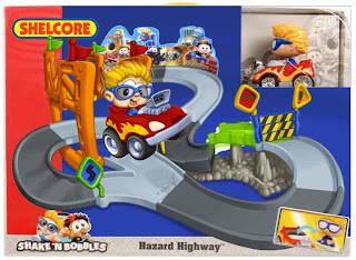
The marketing folks at Shelcore felt the existing art was somewhat inaccurate, as well as busy and confusing in how the set was presented. They also felt the angle of the illustration didn't highlight the features in the best way. So, I was given some new direction and asked to take a crack at it.
Here's the existing;
The main points to tackle; 1. A fun but clear vision of what this thing looked like when in action, 2. A better representation of the item itself, and 3. Instead of featuring the rocking green bridge they wanted to show the car dropping from the upper deck of the orange break-away bridge to the track below.
They did ask me to purposely omit the clumsy dropping platform connected to the bridge for simplicity (which is why it's not seen in the final revised art). Otherwise; "make it look like it works".
To make things easier for myself and Shelcore in assembling the final image, I generated some of the key elements separately. Mainly the character/car, and the track set itself.
Here are the pencil sketches I submitted for approval;
I included a paste-up version with the car in place and given approval on the basics, after a couple of tweaks, I started work on the final art for print. Unfortunately, Shelcore went through some management changes while in progress, and the project was killed.
..Still, not one to let the work done go to waste, I took some time to finish up the project on my own down-time.
Here are the finished illustrated elements as separated;

Finally, I assembled the parts in one piece of art, adding motion to the rocking bridge feature, and bobble-head. Here's the final art ready for print;
..and here's a mock-up of what the revised package may have looked like;


No comments:
Post a Comment